Final Logo Design
Preliminary Round Concepts
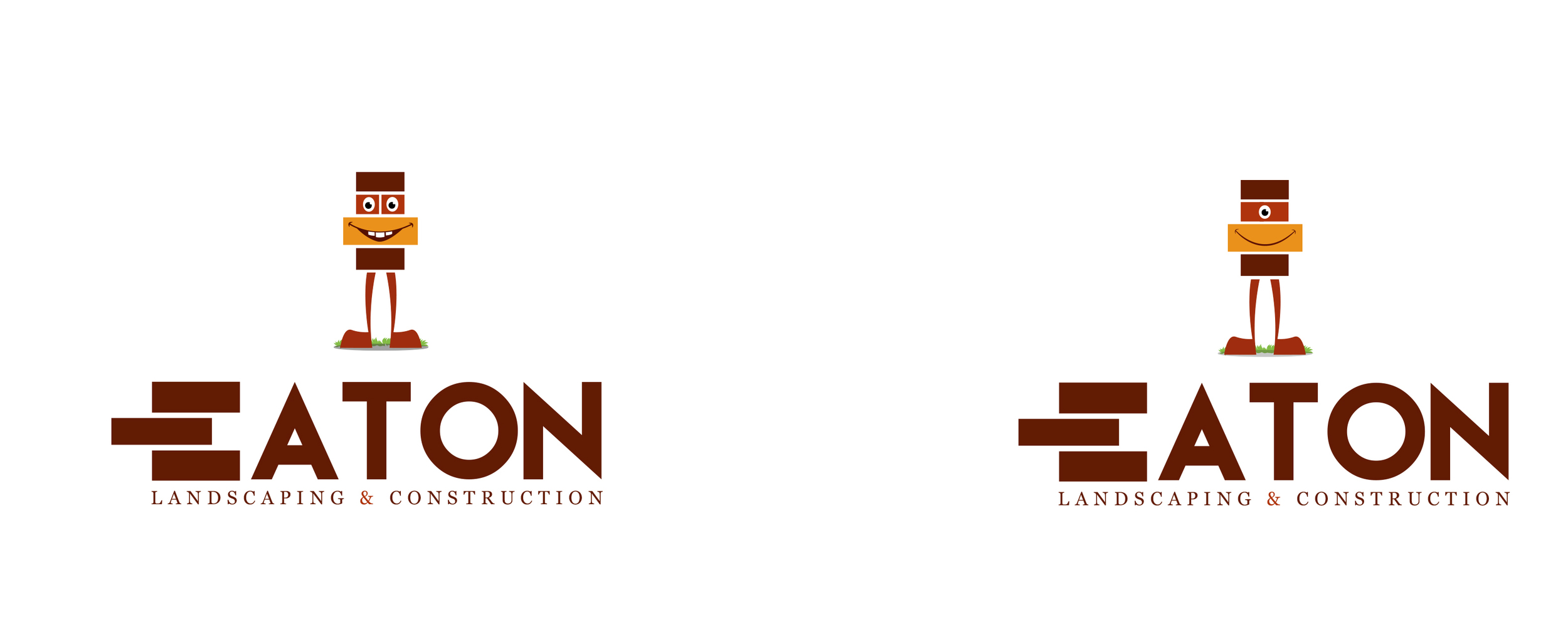
"Brick Monster"
Coupled with a bold san-serif, the mascot design here is simple in it's nature and created using only flat/graphic shapes.
I also manipulated the type to further push the idea of stacked bricks, something key to the landscaping brand.
"Type Play"
With the focus on typography, I utilized the "O" as a garden wall to represent the outdoors and added lighter, contrasting colors to add dimension
'Brick Stance"
The mascot is the star of the show! Made up of bricks and cement, this character radiates personality and presents an engaging and inviting
environment for potential clients. I combined the character with type that flatters the round, exaggerated shapes used in the design.
